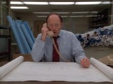
A 30-second American TV commercial from 1984, looking like an authentic broadcast tape of the time:
Overall look: soft, slightly blurry 1980s video image with gentle haze and halation around highlights and windows.
Grain: visible film grain and light analog noise throughout.
Colour: muted, warm and slightly faded, with lifted blacks, soft low contrast and mild colour bleed on reds and yellows.
Lens: a slightly soft vintage lens with edges a little softer than the centre.
Format: 4:3 framing.
Quality: a clean, watchable transfer with no tracking lines, glitches, tape dropouts or VHS distortion. It looks old and soft, but not damaged.
Camera style: shot exactly like a commercial of that era. Locked-off tripod shots at eye level, simple medium shots and medium close-ups, straight cuts between two locations, natural acting with deadpan comic timing.
Characters and sets:
BILL: an architect in his 40s with big glasses, a light-blue shirt and a red striped tie. He sits in a cluttered 1980s office with flat fluorescent light, rolled blueprints on shelves behind him and an open blueprint spread flat across his desk. There is exactly ONE telephone in the office: a cream push-button desk phone sitting on the desk beside the blueprint. Its coiled cord runs from that phone to the single cream handset Bill holds to his ear. No other phones and no extra handsets anywhere.
FRED: a burly construction foreman with a moustache, a yellow hard hat, a denim jacket over a red plaid shirt, and a tool belt. He stands at a timber construction site on an overcast day, with a crew of workers in overalls and hard hats behind him. There is exactly ONE telephone at the site: a red desk phone resting on a wooden plank laid across two sawhorses next to Fred. Its coiled cord runs from that phone to the single red handset Fred holds to his ear. No other phones and no extra handsets anywhere.
SHOT 1 (0–3s): BILL at his desk, phone to his ear, cheerful: “Hello Fred. We had a few changes in the design.”
SHOT 2 (3–5s): FRED at the site, crew behind him, confused: “Uh... changes?”
SHOT 3 (5–10s): BILL leans in, waving his free hand like he’s sketching in the air: “Well... now visualise this, if you will, but the main high beam is now vertical.”
SHOT 4 (10–12s): FRED, squinting, confused: “Vertical?”
SHOT 5 (12–14s): Close insert of BILL’s hand holding a hand-drawn structural sketch up to the phone. BILL (voice over the insert): “And the centre post is horizontal.”
SHOT 6 (14–16s): FRED, slowly and even more confused: “Horizontal.”
SHOT 7 (16–18s): A medium close-up of BILL. A big bold white 1980s TV super appears in the centre of the frame, spelled exactly “LATER”, in a heavy condensed sans-serif with a soft drop shadow.
SHOT 8 (18–20s): BILL on the phone, excited and grinning: “Well Fred? How does it look?”
SHOT 9 (20–24s): FRED in close-up, still confused, looking up at something off-screen: “I don’t know about this, Bill.” The camera then slowly pulls back into a wide shot of the site. The crew stands silently in front of a finished timber building frame that is obviously and absurdly wrong:
the long main roof beam stands straight up out of the middle of the roof like a tall flagpole;
the thick centre post lies sideways on top of the frame;
the walls lean at odd angles;
a doorway sits halfway up a wall with no floor under it.
The workers stare up at it, scratching their heads.
SHOT 10 (24–30s): A classic 1980s video-graphics end card on a dark blue-black background. A plain glossy cream fax machine flies in from the distance in a spinning 3D move, with electric lightning crackling around it. It has no logos, labels or lettering anywhere on it. A perfect copy of the blueprint slides out of it. Chunky chrome-and-purple 80s logo text then slams in, spelled exactly “FAXSTAR”. This is the only text on the card.
A warm, confident 1980s announcer voice-over (over the slow pull-back of shot 9 and into the end card): “Next time, send FaxStar. We can get copies of drawings, graphics, whatever, coast to coast in just 2 hours.”
Sound:
Office room tone.
Distant hammering and machinery at the site.
Phone-line filtering on whichever voice is on the other end.
A light comic synth jingle under the “LATER” section.
A short synth sting on the logo.
No modern elements. No real brand names or logos, and no text anywhere except “LATER” and “FAXSTAR”.